Branding
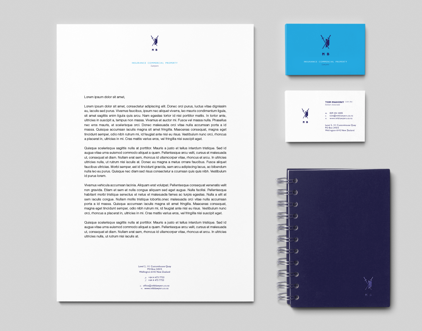
Option A - Champion
Using the concept that lawyers are champions' shows how strong Burrowes current values are and makes them more than just words. They become embodied by a shield to defend clients, along with a sword for each partner to cut though adversaries and paper work. The law firm is upholding old world values such as integrity and bringing them into modern times. Mahony Burrowes is a law firm that you can be proud to be part of and feel strong when they are on your side.

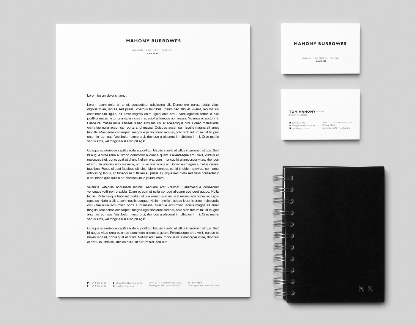
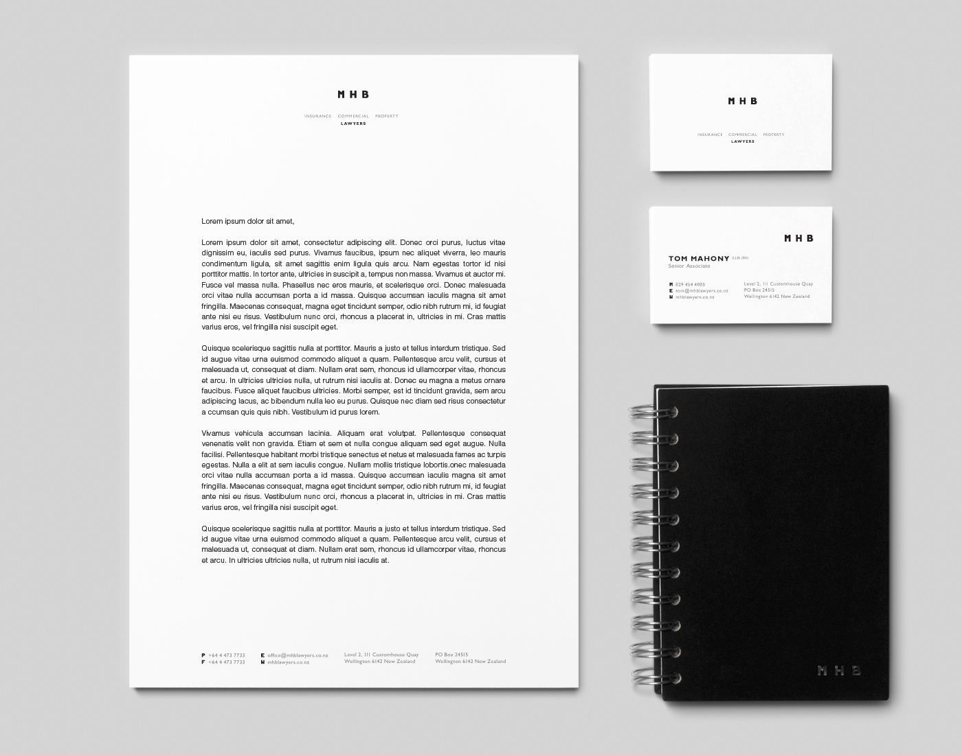
Option B - Modern
The modern branding highlights the law firm's 21st century and progressive nature along with a sleek and streamlined feeling. Incorporating Burrowes original black & white in to this new look makes for a strong dynamic and gives the perception of strength to the law firm. This modern branding is all about being efficient, to the point, clean, clear, optimised & organised. It portrays how the law firm works for their clients.
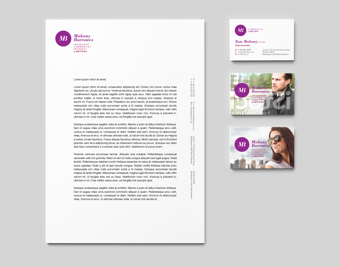
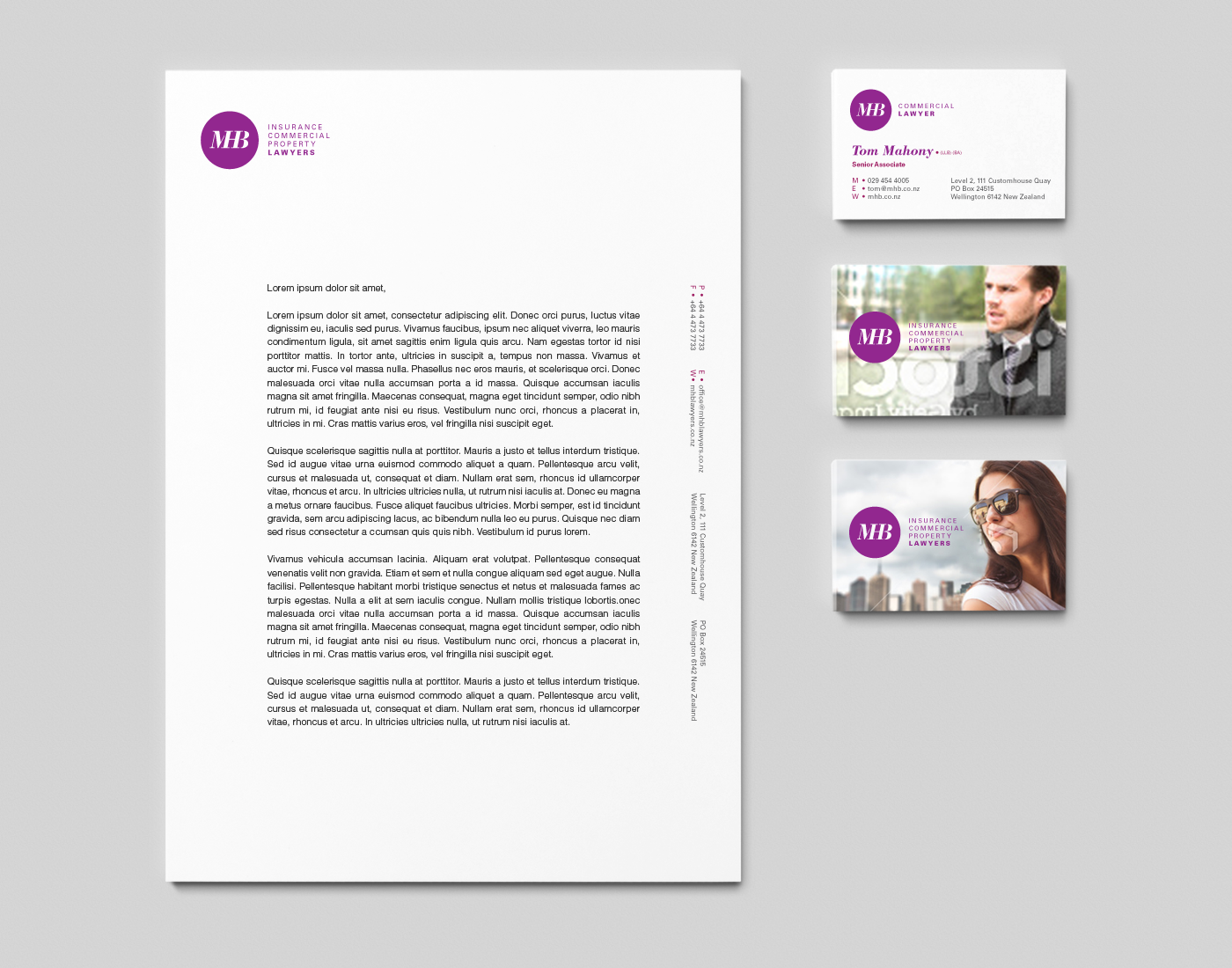
Option C - People
This concept makes the staff and partners the heroes by using photos of each staff member on their own business cards. The firm is relationship focused and this design gives the law firm a strong feel of personality and enthusiasm. Lawyers are people too. The photos give clients a feeling of familiarity, they know who they will be working with and therefore know they do good work. It will also tie back into the website's use of images.